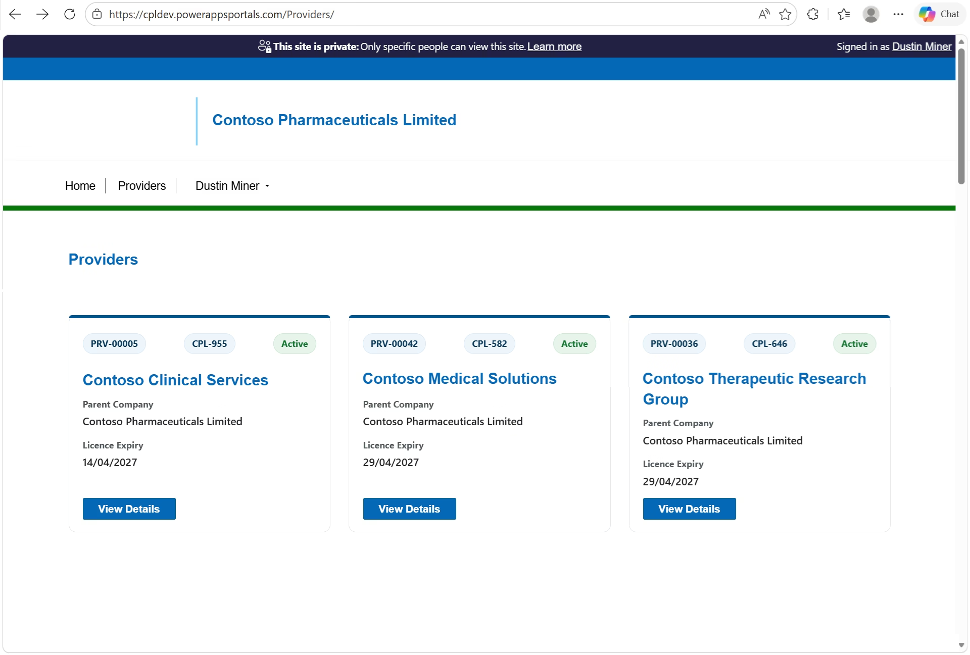
This post presents an example of creating a web template component and presenting it as a grid of cards on a Power Pages web page (Figure 1).
In Detail
Web Template
The following code represents the web template (WT – Fetch XML Get Providers.html) which includes a manifest. The styling of the grid is handled by a CSS grid. The CSS Grid is a recommended layout method for Power Pages components because it’s responsive, dependency-free and easier to control than Bootstrap’s column system. Note that the Microsoft example described in reference 2 below uses bootstrap columns ( col-md-*) to control the layout
{% manifest %}
{
  "type": "Functional",
  "displayName": "Provider Tiles",
  "description": "Renders provider tiles with configurable column count.",
  "tables": ["cpl_provider"],
  "params": [
    {
      "id": "columns",
      "displayName": "# of Columns",
      "description": "less than 12"
    }
  ]
}
{% endmanifest %}

{% assign columnCount = columns | default: 3 %}

<style>
  .provider-tiles {
    --provider-columns: {{ columnCount }};
    display: grid;
    grid-template-columns: repeat(var(--provider-columns), 1fr);
    gap: 20px;
  }
</style>

{% fetchxml providers %}
<fetch version="1.0" output-format="xml-platform" mapping="logical" distinct="false">
  <entity name="cpl_provider">
    <attribute name="cpl_providerid" />
    <attribute name="cpl_name" />
    <attribute name="cpl_providername" />
    <attribute name="cpl_account" />
    <attribute name="cpl_latestlicencenumber" />
    <attribute name="cpl_currentlicencestatus" />
    <attribute name="cpl_currentlicenceexpirydate" />
    <order attribute="cpl_providername" descending="false" />
  </entity>
</fetch>
{% endfetchxml %}

<div class="provider-tiles">

{% for p in providers.results.entities %}
  {% assign parentCompany = p.cpl_account.name %}
  {% assign expiryRaw = p.cpl_currentlicenceexpirydate %}

  <div class="provider-tile">

    <div class="provider-header">
      <div class="provider-licence">{{ p.cpl_name }}</div>
      <div class="provider-licence">{{ p.cpl_latestlicencenumber }}</div>
      <div class="provider-status {{ p.cpl_currentlicencestatus | downcase }}">
        {{ p.cpl_currentlicencestatus }}
      </div>
    </div>

    <h3 class="provider-name">{{ p.cpl_providername }}</h3>

    <div class="provider-detail">
      <span>Parent Company</span>
      <strong>{{ parentCompany }}</strong>
    </div>

    <div class="provider-detail">
      <span>Licence Expiry</span>
      <strong>
        {% if expiryRaw != blank %}
          {{ expiryRaw | date: 'dd/MM/yyyy' }}
        {% else %}
          —
        {% endif %}
      </strong>
    </div>

    <a class="provider-link btn-primary"
       href="/view-provider/?id={{ p.cpl_providerid }}">
       View Details
    </a>

  </div>
{% endfor %}

</div>
Web Page
The web template is referenced in the web page’s copy html
<div class="row sectionBlockLayout text-start" style="display: flex; flex-wrap: wrap; margin: 0px; min-height: auto; padding: 8px;">
  <div class="container" style="display: flex; flex-wrap: wrap;">
    <div class="col-lg-12 columnBlockLayout" style="flex-grow: 1; display: flex; flex-direction: column; min-width: 250px; padding: 16px; margin: 60px 0px;"></div>
    <div>{% include 'WT - Fetch XML Get Providers' columns:"3" %}</div>
  </div>
</div>Power Pages Studio
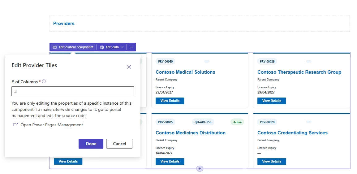
Within the Power Pages studio, the manifest allows the number of columns to be specified (Figure 2). (To see the changes, the browser needs to be refreshed.)
Appendix
The CCS used by the web template
.provider-tiles {
  display: grid;
  grid-template-columns: repeat(auto-fill, minmax(340px, 1fr));
  gap: 24px;
  margin: 28px 0;
}

/* Card */
.provider-tile {
  position: relative;
  background: #ffffff;
  border: 1px solid #e3e6ea;
  border-radius: 10px;
  padding: 18px 18px 16px;

  /* keeps button aligned at bottom */
  display: flex;
  flex-direction: column;

  transition: box-shadow 0.2s ease, transform 0.2s ease, border-color 0.2s ease;
}

/* Thin brand accent (more modern than a thick blue bar) */
.provider-tile::before {
  content: "";
  position: absolute;
  left: 0;
  top: 0;
  height: 4px;
  width: 100%;
  background: #00558c; /* QH blue */
  border-top-left-radius: 10px;
  border-top-right-radius: 10px;
}

.provider-tile:hover {
  border-color: #cfd6dd;
  box-shadow: 0 10px 22px rgba(0, 0, 0, 0.08);
  transform: translateY(-2px);
}

/* Header row */
.provider-header {
  display: flex;
  justify-content: space-between;
  align-items: center;
  margin-top: 6px;
  margin-bottom: 10px;
}

/* Licence number as a pill badge */
.provider-licence {
  font-size: 12px;
  font-weight: 700;
  color: #0b3a57;
  background: #eef6fb;
  border: 1px solid #d7eaf6;
  padding: 4px 10px;
  border-radius: 999px;
}

/* Status badge */
.provider-status {
  font-size: 12px;
  font-weight: 700;
  padding: 4px 10px;
  border-radius: 999px;
  text-transform: capitalize;
  border: 1px solid transparent;
}

/* Common status variants */
.provider-status.active {
  background: #e6f4ea;
  color: #137333;
  border-color: #cbe8d2;
}

.provider-status.inactive {
  background: #fdecea;
  color: #a50e0e;
  border-color: #f6c7c3;
}

/* If your status label ever becomes "expired" */
.provider-status.expired {
  background: #fff4e5;
  color: #b06000;
  border-color: #ffd8a8;
}

/* Provider name */
.provider-name {
  font-size: 20px;
  font-weight: 800;
  line-height: 1.25;
  margin: 10px 0 14px;
  color: #1b1b1b;

  /* keep card heights consistent */
  display: -webkit-box;
  -webkit-line-clamp: 2;
  -webkit-box-orient: vertical;
  overflow: hidden;
}

/* Detail blocks */
.provider-detail {
  margin-bottom: 12px;
}

.provider-detail span {
  display: block;
  font-size: 12px;
  font-weight: 700;
  color: #505a5f; /* neutral gov grey */
  margin-bottom: 3px;
}

.provider-detail strong {
  display: block;
  font-size: 14px;
  font-weight: 600;
  color: #222;
  word-break: break-word;
}

/* Button */
.provider-link {
  margin-top: auto;          /* pushes to bottom */
  align-self: flex-start;    /* aligns left */

  display: inline-block;
  padding: 10px 16px;
  background-color: #005eb8;
  color: #ffffff !important;
  font-size: 14px;
  font-weight: 700;
  border-radius: 6px;
  text-decoration: none;
  line-height: 1.1;
  border: 1px solid #004a94;
  transition: background-color 0.2s ease, box-shadow 0.2s ease;
}

.provider-link:hover,
.provider-link:focus {
  background-color: #004a94;
  text-decoration: none;
  box-shadow: 0 2px 10px rgba(0, 0, 0, 0.18);
}

.provider-link:focus-visible {
  outline: 3px solid #ffbf47; /* gov focus yellow */
  outline-offset: 2px;
}

/* Mobile: full-width button */
@media (max-width: 576px) {
  .provider-tiles {
    grid-template-columns: 1fr;
  }

  .provider-link {
    width: 100%;
    text-align: center;
  }
}

.provider-status.suspended {
    background: rgb(230, 244, 234);
    color: darkred;
}

.provider-status.cancelled {
    background: rgb(230, 244, 234);
    color:darkred;
;
}References
1.) https://www.youtube.com/watch?v=2RZQ9B2yx1s&t=66s
2.) https://learn.microsoft.com/en-us/power-pages/configure/web-templates-as-components