This post provides a walkthrough of building a lightweight virtual React based PCF control (Figure 1). This particular control supports two display modes: a ‘No Unknown Yes’ slider and a ‘Percentage’ slider, configurable at design time

Configure the Control
Before creating the control, we’ll first walk through how it can be configured as a ‘No Unknown Yes’ slider
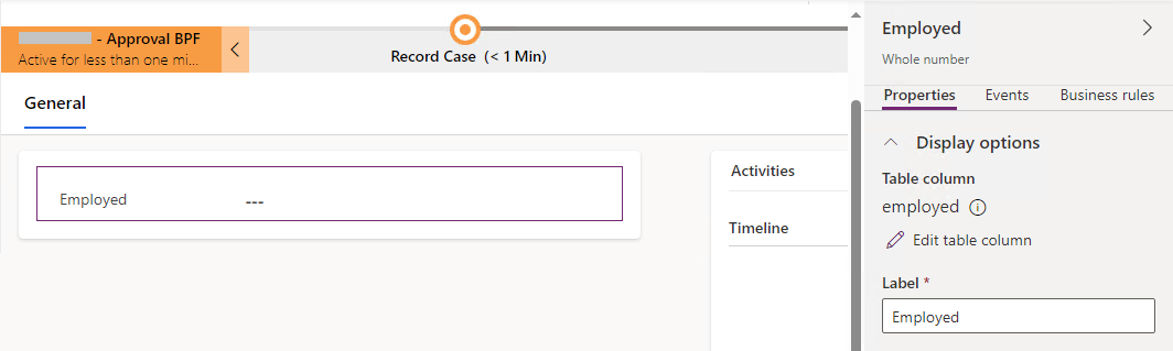
1.) Add a whole number column named cpl_employed to the form (Figure 2)
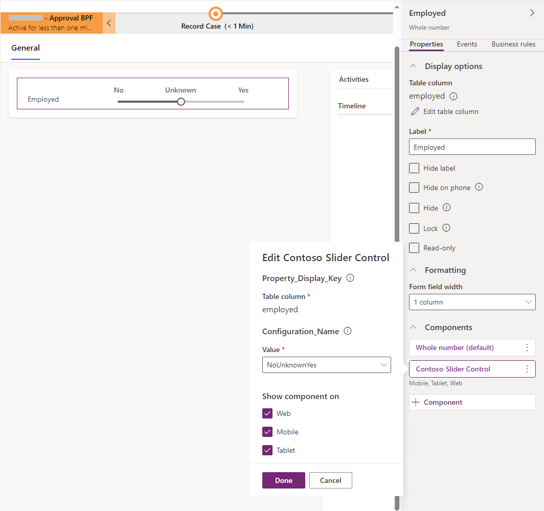
2.) Add the pcf control to the cpl_employed column (Figure 3)
Create the Control
The first step in creating the control is to execute the following line. This creates the control’s scaffolding. Note:
- -ns: Namespace
- -n: Name
- -t: Template type. This can either be ‘field’ or ‘dataset’
- -npm: Initialise npm. Will setup package.json and run npm install to download the necessary dependencies
- -fw: Framework
pac pcf init -ns ContosoPcfControls -n SliderControl -t field -npm -fw reactNext, the control is updated with code based on references 1 & 2 (listed at the bottom of this post)
The resulting code for the completed control is as follows:
SliderControl
     - ControlManifest.Input.xml
     - index.ts
     - SliderComponent.tsx
     css
           - SliderControl.css
.eslintrc.json
.gitignore
package.json
package-lock.json
pcfconfig.json
README.md
SliderControl.pcfproj
tsconfig.jsonThe following code snippet shows the ControlManifest.Input.xml file. This serves as the cornerstone of the PCF control. It defines the control’s capabilities and ensures it is recognised by the Power Apps runtime. In essence, this file acts as the contract between the control and the Power Platform
Key aspects to note:
- Line 4 – Declares the control as a virtual control
- Lines 45 & 46 – References the platform provided React and Fluent UI libraries. This allows the control to leverage the shared resources instead of bundling them into the control’s bundle.js
<?xml version="1.0" encoding="utf-8" ?>
<manifest>
  <control namespace="ContosoPcfControls" constructor="SliderControl" version="0.0.10" display-name-key="Contoso Slider Control"
      description-key="Contoso Slider Control description" control-type="virtual" >
	  <!--external-service-usage node declares whether this 3rd party PCF control is using external service or not, if yes, this
	     control will be considered as premium and please also add the external domain it is using.
    If it is not using any external service, please set the enabled="false" and DO NOT add any domain below. The "enabled" will be false by default.
    Example1:
      <external-service-usage enabled="true">
        <domain>www.Microsoft.com</domain>
      </external-service-usage>
    Example2:
      <external-service-usage enabled="false">
      </external-service-usage>
    -->
	  <external-service-usage enabled="false">
		  <!--UNCOMMENT TO ADD EXTERNAL DOMAINS
      <domain></domain>
      <domain></domain>
      -->
	  </external-service-usage>
	  <!-- property node identifies a specific, configurable piece of data that the control expects from CDS -->

	  <property name="value" display-name-key="Property_Display_Key" description-key="Property_Desc_Key" of-type="Whole.None"
	     usage="bound" required="true"/>
	  <property name="configuration" display-name-key="Configuration_Name" description-key="Configuration_Desc" of-type="Enum"
	     default-value="0" usage="input" required="true">
		  <value name="NoUnknownYes" display-name-key="No Unknown Yes" description-key="NoUnknownYes_Desc">0</value>
		  <value name="Percentage" display-name-key="Percentage" description-key="LivingArrangementPercentage_Desc">1</value>
	  </property>

	  <!--
      Property node's of-type attribute can be of-type-group attribute.
      Example:
      <type-group name="numbers">
        <type>Whole.None</type>
        <type>Currency</type>
        <type>FP</type>
        <type>Decimal</type>
      </type-group>
      <property name="sampleProperty" display-name-key="Property_Display_Key" description-key="Property_Desc_Key" of-type-group="numbers" usage="bound" required="true" />
    -->
	  <resources>
		  <code path="index.ts" order="1"/>
		  <platform-library name="React" version="16.8.6" />
		  <platform-library name="Fluent" version="8.29.0" />
          <css path="css/SliderControl.css" order="1" />
		  <!-- UNCOMMENT TO ADD MORE RESOURCES
          <resx path="strings/ChoicesPickerReact.1033.resx" version="1.0.0" />
      -->
	  </resources>
	  <!-- UNCOMMENT TO ENABLE THE SPECIFIED API
    <feature-usage>
      <uses-feature name="Device.captureAudio" required="true" />
      <uses-feature name="Device.captureImage" required="true" />
      <uses-feature name="Device.captureVideo" required="true" />
      <uses-feature name="Device.getBarcodeValue" required="true" />
      <uses-feature name="Device.getCurrentPosition" required="true" />
      <uses-feature name="Device.pickFile" required="true" />
      <uses-feature name="Utility" required="true" />
      <uses-feature name="WebAPI" required="true" />
    </feature-usage>
    -->
  </control>
</manifest>
The following code snippet shows the index.ts file. It defines the lifecycle methods that define how the control behaves, renders and interacts with the Power Platform.
Key aspects to note:
Line 33 – Performs a destructurng assignment to extract control parameters, as defined in the manifest.
- value = 1 (Corresponds to the value stored in the bound field cpl_employed)
- configuration = 0 (Maps to the ‘NoUnknownYes’ display mode)
Line 35 – Evaluates whether the input parameters are present by checking if the condition is truthy
import { IInputs, IOutputs } from "./generated/ManifestTypes";
import * as React from "react";
import { SliderComponent } from "./SliderComponent";

export class SliderControl implements ComponentFramework.ReactControl<IInputs, IOutputs> {
	private notifyOutputChanged: () => void;
	private selectedValue: number | undefined;

	/**
	 * Used to initialize the control instance. Controls can kick off remote server calls and other initialization
	 * actions here.
	 * Data-set values are not initialized here, use updateView.
	 * @param context The entire property bag available to control via Context Object; It contains values as set up
	 * by the customizer mapped to property names defined in the manifest, as well as utility functions.
	 * @param notifyOutputChanged A callback method to alert the framework that the control has new outputs ready to
	 * be retrieved asynchronously.
	 * @param state A piece of data that persists in one session for a single user. Can be set at any point in a
	 * controls life cycle by calling 'setControlState' in the Mode interface.
	 * @param container If a control is marked control-type='standard', it will receive an empty div element within
	 * which it can render its content.
	 */
	public init(context: ComponentFramework.Context<IInputs>, notifyOutputChanged: () => void): void {
		this.notifyOutputChanged = notifyOutputChanged;
	}

	/**
	 * Called when any value in the property bag has changed. This includes field values, data-sets, global values
	 * such as container height and width, offline status, control metadata values such as label, visible, etc.
	 * @param context The entire property bag available to control via Context Object; It contains values as set up
	 * by the customizer mapped to names defined in the manifest, as well as utility functions
	 */
	public updateView(context: ComponentFramework.Context<IInputs>): React.ReactElement {
		const { value, configuration } = context.parameters;

		if (value && configuration) {
			return React.createElement(SliderComponent, {configuration: configuration.raw, value: value.raw, onChange: this.onChange});
		}
		return React.createElement("div");
	}

	private onChange = (newValue: number | undefined): void => {
		this.selectedValue = newValue;
		this.notifyOutputChanged();
	};

	/**
	 * It is called by the framework prior to a control receiving new data.
	 * @returns an object based on nomenclature defined in manifest, expecting object[s] for property marked as “bound” or “output”
	 */
	public getOutputs(): IOutputs {
		return { value: this.selectedValue } as IOutputs;
	}

	/**
	 * Called when the control is to be removed from the DOM tree. Controls should use this call for cleanup.
	 * i.e. cancelling any pending remote calls, removing listeners, etc.
	 */
	public destroy(): void {
		// Add code to cleanup control if necessary
	}
}The following code snippet shows the SliderComponent.tsx file. Key aspects to note:
Line 20 – React.memo (Definition from https://react.dev/reference/react/memo – Wrap a component in memo to get a memozied version of that component. This memoized version of your component will usually not be re-rendered when its parent component is re-rendered as long as its props have not changed.)
Line 25 – React.useCallback (Definition from https://react.dev/reference/react/useCallback – Call useCallback at the top level of your component to cache a function definition between re-renders)
import { Slider } from "@fluentui/react";
import * as React from "react";

enum NoUnknownYes {
    No = 0,
    Unknown = 1,
    Yes = 2
}
enum SliderType {
    NoUnknownYes = '0',
    Percentage = '1'
}

export interface SliderComponentProps {
    value: number | null;
    configuration: string | null;
    onChange: (newValue: number | undefined) => void;
}

export const SliderComponent = React.memo((props: SliderComponentProps) => {
    const { value, configuration, onChange } = props;
    const valueKey = value ?? undefined;
    const sliderValueFormat = (value: number) => `${value}%`;

    const onChangeSlider = React.useCallback(
        (value: number): void => {
            onChange(value);
        },
        [onChange]
    );

    if (configuration === SliderType.NoUnknownYes) {
        return (
            <div className="slider">
                <div className="nounknownyes">
                    <div className="No">No</div>
                    <div className="Unknown">Unknown</div>
                    <div className="Yes">Yes</div>
                </div>
                <Slider min={NoUnknownYes.No} max={NoUnknownYes.Yes} step={1} defaultValue={NoUnknownYes.Unknown} showValue={false} value={valueKey} onChange={onChangeSlider} vertical={false} />
            </div>
        );
    }
    else if (configuration === SliderType.Percentage) {
        return (
            <div className="slider">
                <Slider max={100} valueFormat={sliderValueFormat} showValue value={valueKey} onChange={onChangeSlider} />
            </div>
        );
    }
    else
        return null;
});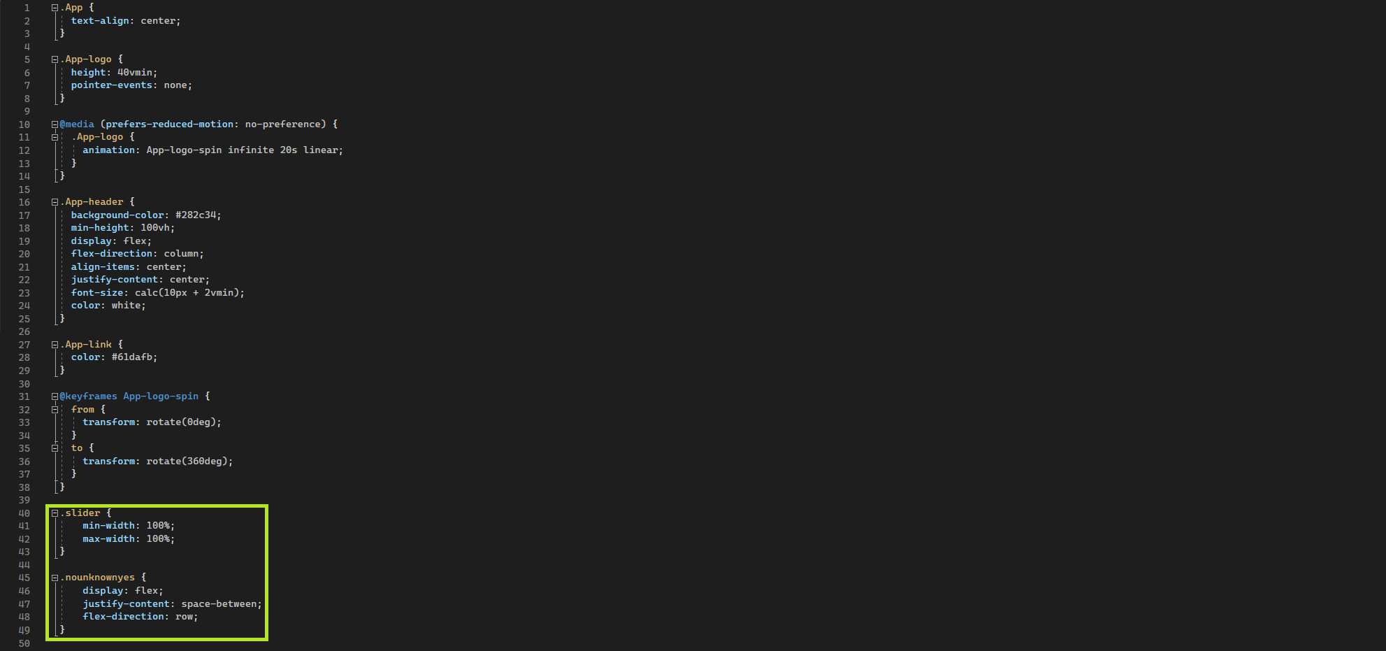
SliderComponent.displayName = "SliderComponent";The code snippet below is the SliderControl.css
.slider {
    min-width: 100%;
    max-width: 100%;

}
.nounknownyes {
    display: flex;
    justify-content: space-between;
    flex-direction: row;
}The code snippet below is package.json
{
  "name": "pcf-project",
  "version": "1.0.0",
  "description": "Project containing your PowerApps Component Framework (PCF) control.",
  "scripts": {
    "build": "pcf-scripts build",
    "clean": "pcf-scripts clean",
    "lint": "pcf-scripts lint",
    "lint:fix": "pcf-scripts lint fix",
    "rebuild": "pcf-scripts rebuild",
    "start": "pcf-scripts start",
    "refreshTypes": "pcf-scripts refreshTypes"
  },
  "dependencies": {
    "@fluentui/react": "^8.29.0",
    "react-dom": "^16.8.6"
  },
  "devDependencies": {
    "@microsoft/eslint-plugin-power-apps": "^0.2.6",
    "@types/node": "^18.8.2",
    "@types/powerapps-component-framework": "^1.3.4",
    "@typescript-eslint/eslint-plugin": "^5.39.0",
    "@typescript-eslint/parser": "^5.39.0",
    "eslint": "^8.24.0",
    "eslint-plugin-import": "^2.26.0",
    "eslint-plugin-node": "^11.1.0",
    "eslint-plugin-promise": "^6.0.1",
    "eslint-plugin-react": "^7.31.8",
    "pcf-scripts": "^1",
    "pcf-start": "^1",
    "react": "^16.14.0",
    "typescript": "^4.8.4"
  }
}
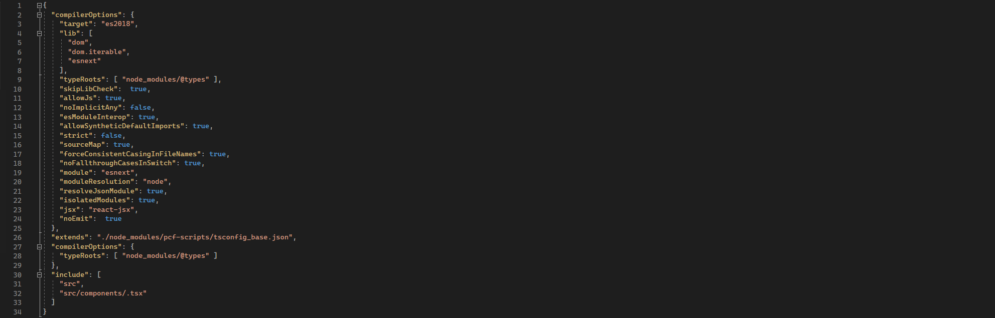
The code snippet below is tsconfig.json
{
    "extends": "./node_modules/pcf-scripts/tsconfig_base.json",
    "compilerOptions": {
        "typeRoots": ["node_modules/@types"],
    }
}Test the control
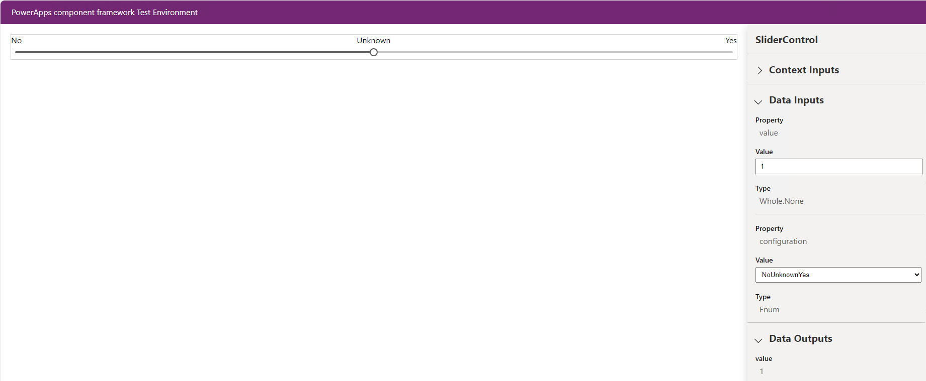
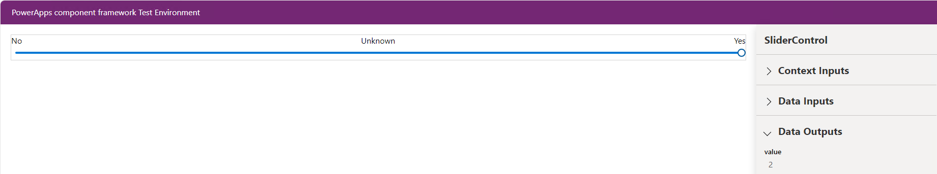
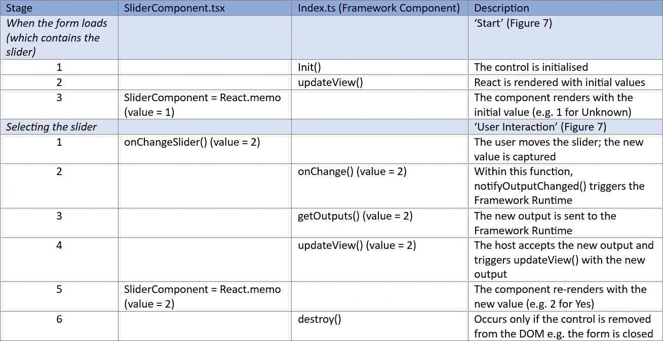
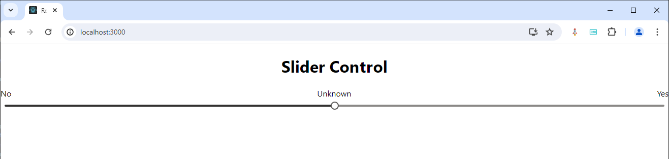
Referring to Figure 4 & 5, the slider is moved from ‘Unknown’ to ‘Yes’
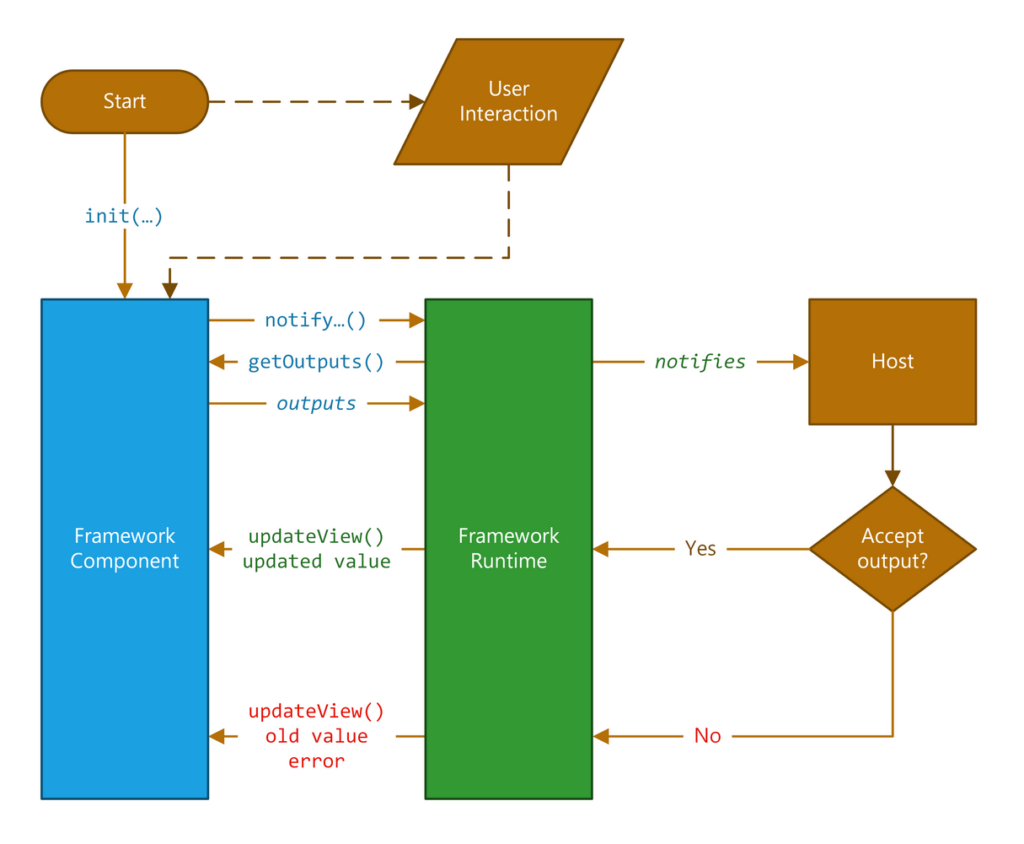
Lifecycle of the control
Appendix
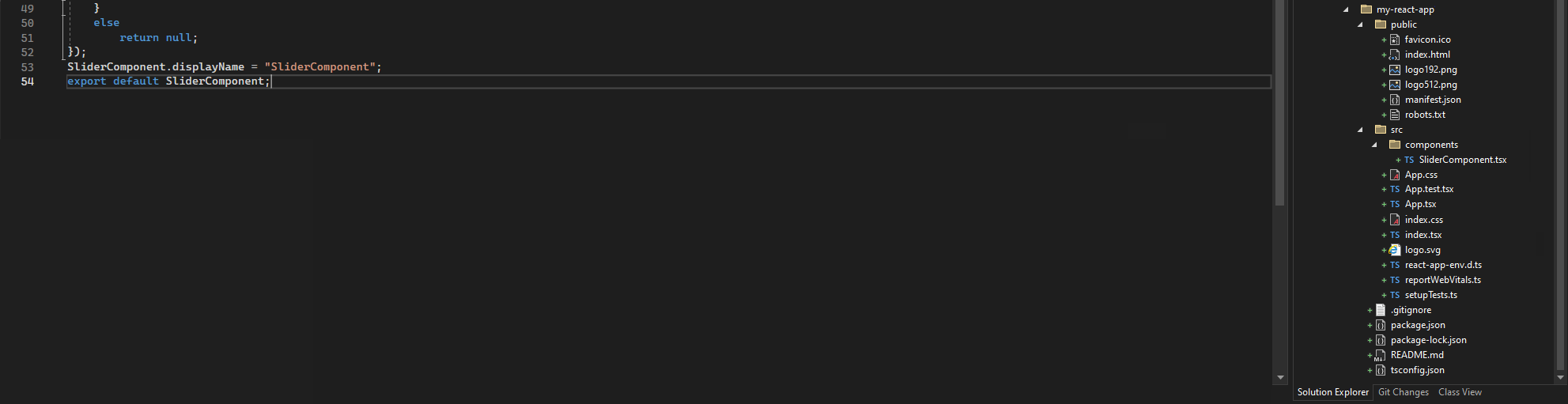
This section describes how to test (very limited testing in this case) the slider component within a React app (Figure 8)
React App
1.) Create the React app
In the ‘Developer PowerShell’ of Visual Studio, type
- npx create-react-app my-react-app –template typescript
- cd my-react-app
- npm run build
- npm start
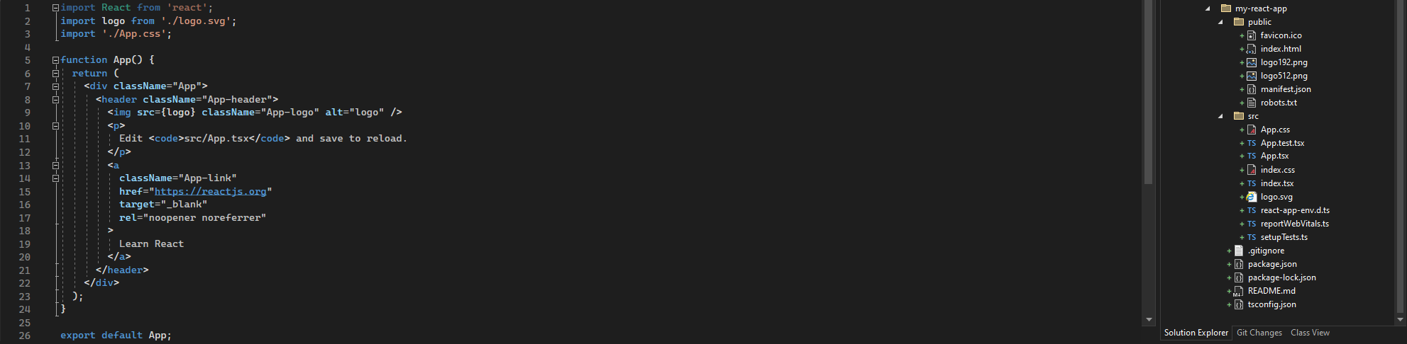

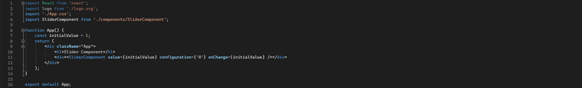
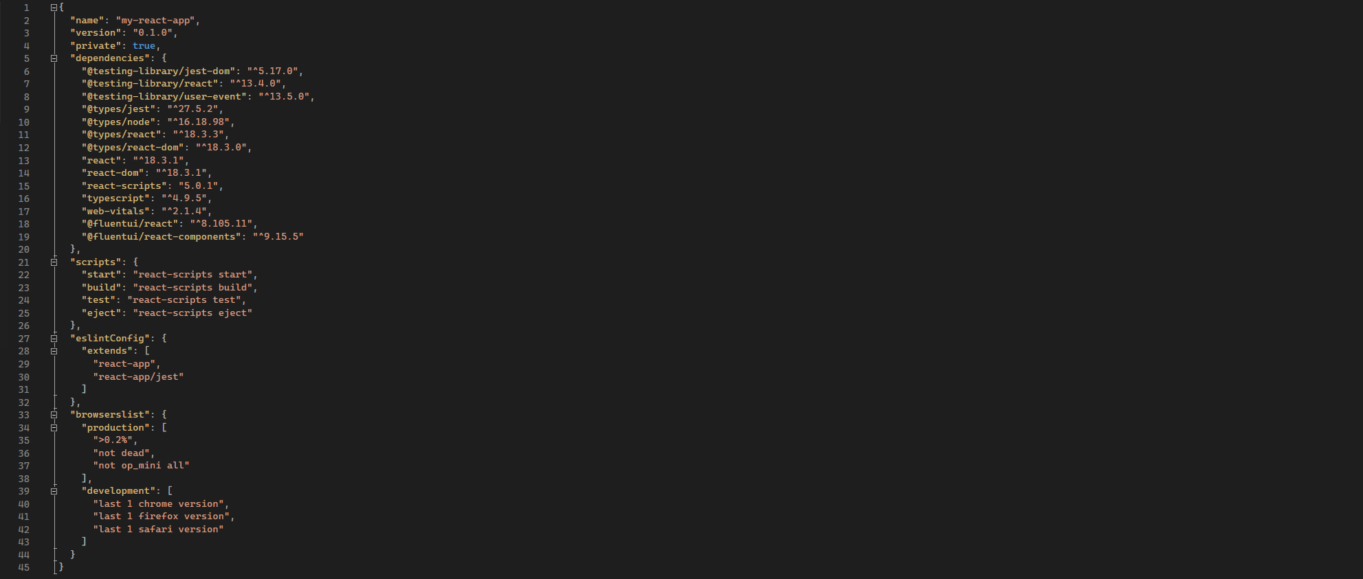
2.) Add the slider control to the newly created react app by adding or updating the following files (refer to Figures 11 thru to 15)
- SliderComponent.tsx
- App.tsx
- App.css
- package.json
- tsconfig.json
Then in the ‘Developer PowerShell’ of Visual Studio, execute the commands
- npm install
- npm start
Note: if the following error is generated, make sure the case of each folder structure matches
[eslint] Plugin “react” was conflicted between “package.json >> eslint-config-react-app >> C:\Users\dminer\source\repos\products-framework\code\Pcf.Controls\my-react-app\node_modules\eslint-config-react-app\base.js and “BaseConfig >> C:\Users\dminer\source\repos\products-framework\Code\Pcf.controls\my-react-app\node_modules\eslint-config-react-app\base.js
Further reading
Create and deploy a standard pcf control
References
2.) https://developer.microsoft.com/en-us/fluentui#/controls/web/slider
4.) https://developer.mozilla.org/en-US/docs/Web/JavaScript/Reference/Statements/if…else
5.) https://react.dev/reference/react/createElement
6.) Powerful Devs Conference 1:54:48
7.) https://create-react-app.dev/docs/getting-started
8.) Virtual React PCF Code Components
9.) Building awesome PCF’s using React Hooks – David Rivard
10.) Hooked to PCF – React Hooks in PCF Development – Power Apps Development Bootcamp